
Cloud Dancer
Thoughts on Pantone Color of the Year 2026

I have been paying attention to Pantone’s announcements about Color of the Year for quite awhile. What started as something fun to predict in the professional workplace as full-time graphic designer became something more for me and five years ago I started to take the color(s) and create self-motivated personal projects with them.
In 2020 Classic Blue became my Blue Rose enamel pin project. In 2021 two colors were selected: Ultimate Gray and Illuminating (yellow). That year I created two projects. One was a Bumble Bee acrylic pin with my character from my comic strip Curls using both the colors. The other project was the pandemic inspired face cover bandana I called Banana Bandana that used the yellow (I also did a variant bandana in brown). In 2022 Very Peri was announced and I used it for a Mother’s Day enamel pin I called Thank You Mom. In 2023 we had Viva Magenta and I repurposed the rose to create a Red Rose enamel pin color variant. Halfway through the year I wished to have made a pomegranate character with that prompt, but time had already passed and 2024 granted me with a fruit theme nonetheless! In 2024 Peach Fuzz was introduced and I created a Peach Fuzz character and made it into an enamel pin. In 2025 we had Mocha Mousse and I did two Curls comic strips with my commentary on the color. Oddly enough this year I revisited my pomegranate character idea I had in a sketchbook and created Queen Pomegranate as part of my Fruits sticker sheet and as a standalone sticker as well.


This small obsession about the Color of the Year announcements had led me to create fun and joyful wearable art pieces and share them with others (you can buy them from my online store). In late 2021 The Wall Street Journal reached out to me for their article on the newly announced 2022 color, which appeared below the fold on the front page in newsprint, so it has been rewarding to invest my interest in the topic of color. I do wish to one day collaborate or work with Pantone in some capacity. The closest I got was to do some design work for Veralto Corporation, a spin-off of Danaher. I have designed many of the Danaher Corporation’s annual reports.


Which leads us to earlier this month when Pantone introduced Color of the Year 2026, Cloud Dancer:
A lofty white neutral whose aerated presence acts as a whisper of calm and peace in a noisy world. PANTONE 11-4201 Cloud Dancer symbolizes a calming influence in a society rediscovering the value of quiet reflection.
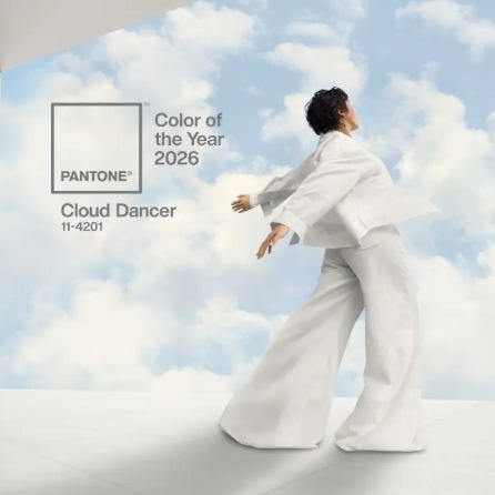
Cloud Dancer is essentially white with absence of most color. The tiniest bit of hue has been added to make it the slightest off-white. In light physics, white is all colors combined; in art, white is the lack of color.
A lot of the online reaction has been politically influenced and most people seem to not like the choice due to rising influence of white supremacy in the United States. If you look at it from an outsider perspective, people who are not artists or designers will think it is silly to announce a color that is essentially no color! You have a rainbow of colors to select from and then we get… white? There is also an interesting perspective of having three skin tones in a row with Peach Fuzz, Mocha Mousse, and now Cloud Dancer. If we want to go even further with a race issue, Cloud Dancer as a name could be a Native American reference. There could even be a heaven statement and we can discuss the religion element with the rebirth and purity of white. I do see it as a way for people to talk about these tough subjects starting out in a simple way through color theory. Everything is political these days, even color.
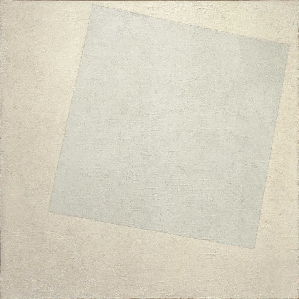
Speaking of supremacy — have you heard of Suprematism? An early 20th-century art movement focused on the fundamentals of geometry (circles, squares, rectangles), painted in a limited range of colors. One of the first things I thought of when seeing the Cloud Dancer announcement was this paining called White on White by Kazimir Malevich. It was introduced to me by my high school art teacher, David Evelyn.
Personally, if Pantone wanted a whiteish color, I think they should have injected more color into it and had it be more of an off-white light blue. It could still have the peaceful calm they were aiming for with more hue. It could have solved a lot of this backlash and public reaction. People are paying attention to the news and that is a good thing, but I don’t want Color of the Year to be a joke. The Wall Street Journal article I was quoted in already discussed how paint companies and other businesses are now jumping in to make Color of the Year proclamations, to which I said the marketplace is becoming oversaturated (see what I did there?).
For fashion, I don’t enjoy white because it gets dirty so quickly and I hardly own any white clothing besides some promotional white shirts. I have a few white items that I rarely wear for fear of harming the clothing. A cool martial arts myth I learned earlier this year about the color white with a Taekwondo outfit, called a dobok, is that it symbolizes a beginner student’s willingness to learn. The white belt is never to be washed because that would release away knowledge and hard work and the sweat and dirt is a visual sign of the mastery.
The reset concept of starting fresh, turning a new page, a blank canvas with the white is reviving. However Pantone as a global forecast of consumer color consumption should have added a touch of blue or made it a bit more off-white and less bland. I do think they were leaning towards a minimalism ideal.
Color needs color. However if there was any year to have a refresh let 2026 be it. My advice is to allow Cloud Dancer be a color spirit to guide us with a clean new start in the new year. If you don’t like white walls, paint them, or tear them down if you need to. Make your own Color of the Year (my prediction was for Tealquoise, my combination of turquoise and teal). Embrace all the colors because they each represent the beauty of life, as should it be with all humankind.